
Valuable, on-point guidance about most pertinent consideration of-the-moment for people getting stuff done while on-the-go
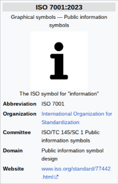
Travellers can recount fortunate moments of timely access to key information that’s genuinely beneficial – sometimes it’s how disaster is avoided, and sometimes it’s how the most memorable experiences come together. These episodes may spark visions of prominently serifed “i” within a circle, which is international standard for where to get informed, substantiated as ISO7001 according to the International Organization for Standardization. The most common association for this symbol is atop an information booth by some busy intersection, popular landmark or transportation hub, ideally staffed by someone with resourcefulness, communication skills, friendliness and positivity to satisfy people encountered whose situations are directly improved.
There.App Co. aspires to the standards of the best information booth professionalism provided within the most hectic circumstances. Our solution approach is to be on point with promotion of the detail or feature likely to matter most in the moment, and not distract. We try to succinctly convey just what’s needed with clear presentation of relevant actions, directing everything to get set within a tap or two.
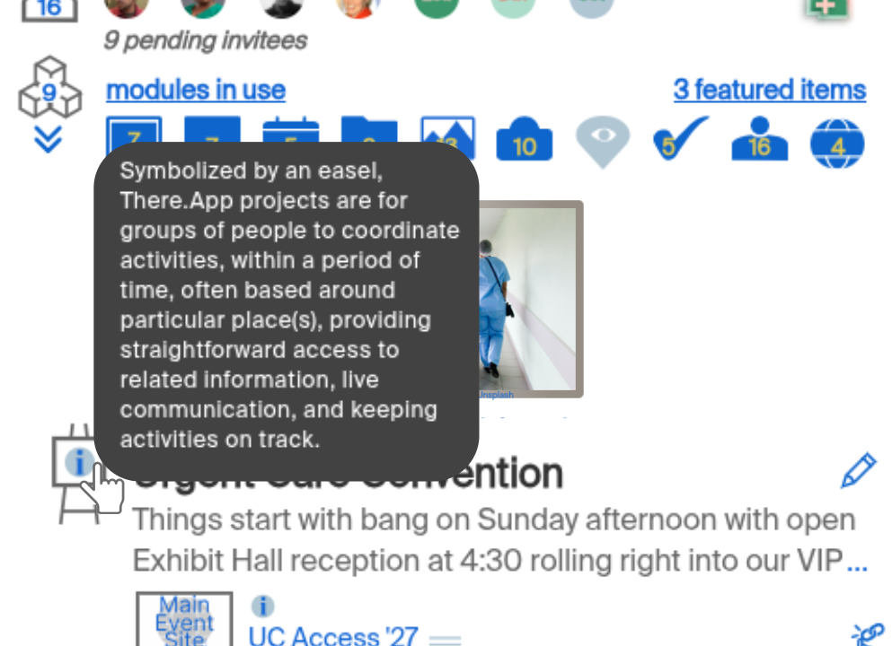
We employ the information-booth-associated circle-i symbol wherever it seems some extra guidance could effectively promote best use of There.App. The icon often appears in a spot or two within particular pages, to illuminate important but perhaps non-obvious organization, capabilities and methods. The payoff for tapping the icon is revealing half-sentence to couple sentences of targeted information delivered on top of the screen. It’s just about what can be done where the icon appears with objective to inform succinctly and guide great real-world execution by our customer. The circle-i icon selection feels consistent with our approach besides its being foundational within wayfinding, the art and craft of smoothly guiding people on the move, which inspires our software design and company branding.
There’s interesting consideration around this circle-i presentation being some expansion of scope within There.App. The symbol appears on about half of our screens and in a few cases it appears a few times within the same page. Regardless of how familiar someone may be with our solution, they’ll still see this sprinkled throughout the app. But sparsely, and in a subtle design that visually blends in with other elements on screen, and the consequence of accidentally mousing over it or (less frequently) accidentally tapping it are near-zero – just continue mousing another fraction of an inch, or tap a 2nd time and it’s vanished. It’s integrated in a way to not bother There.App experts which gets to our emphasis facilitating a sort-of flow-state in everyone’s use. We have a settings screen where the only switches are whether person wants to employ master kill-switch for no live sharing of location in any project, and whether person prefers 24:00 time presentation or A/PM, and we’ work to keep that overhead within There.App lean in support of on-the-go professionals who don’t want to be several screens deep buried in decision making. So, circle-i is there for everyone, unobtrusively, and doesn’t get turned-off.
With our consistent expansion of lightweight & functional modules (work on a few new ones is underway right now), there will occasionally be a circle-i of value to even the most seasoned There.App veteran accelerating them getting pointed in the right direction, perhaps in a crucial moment, like getting off of some overnight transportation into a clean & well-lit hall with central information booth, that has clear signs, organized racks of information, no lines, and friendly, multi-lingual reception at your timely service.




.png)


