Do It Your Way (Or, Try It Ours)
We've got our opinions about how to best use There.App, which we pair with incorporation of what customers suggest
These days a lot of software companies are proud about their programs being “opinionated”, and while this post may be the first time labeling There.App Co with that word, it’s a fit. Our founding was inspired by experiences coordinating activities on location and realizing that collaborative software development has proceeded in directions that don’t align. There are too many apps to juggle while moving about in order to reference schedule, access project info, track execution of goals, communicate within often fluid teams etc. And those apps tend to be designed for office use, packing in too many features for productivity on-the-go, and they generally lack perspective on where things have to happen, and they distractingly lure attention to other matters when focus should be on live and in-person activities.
So, clearly, we've brought opinions about the sort of program to build. There.App is a balanced suite with consistent, straightforward access to team directory, shared files, task tracking, chat, calendar and more. It adds location perspective like pinning key places and seeing where each other is, including map views across every functional module. The focus is always on the project at hand without distracting prompts about other things going on. Unlike most software geared to maximize screen time, we pinpoint emphasis on just what matters in the moment for prompt execution that returns attention back to the live setting. Our mobile-first application is as lightweight and refined as it is broadly comprehensive in functional scope.
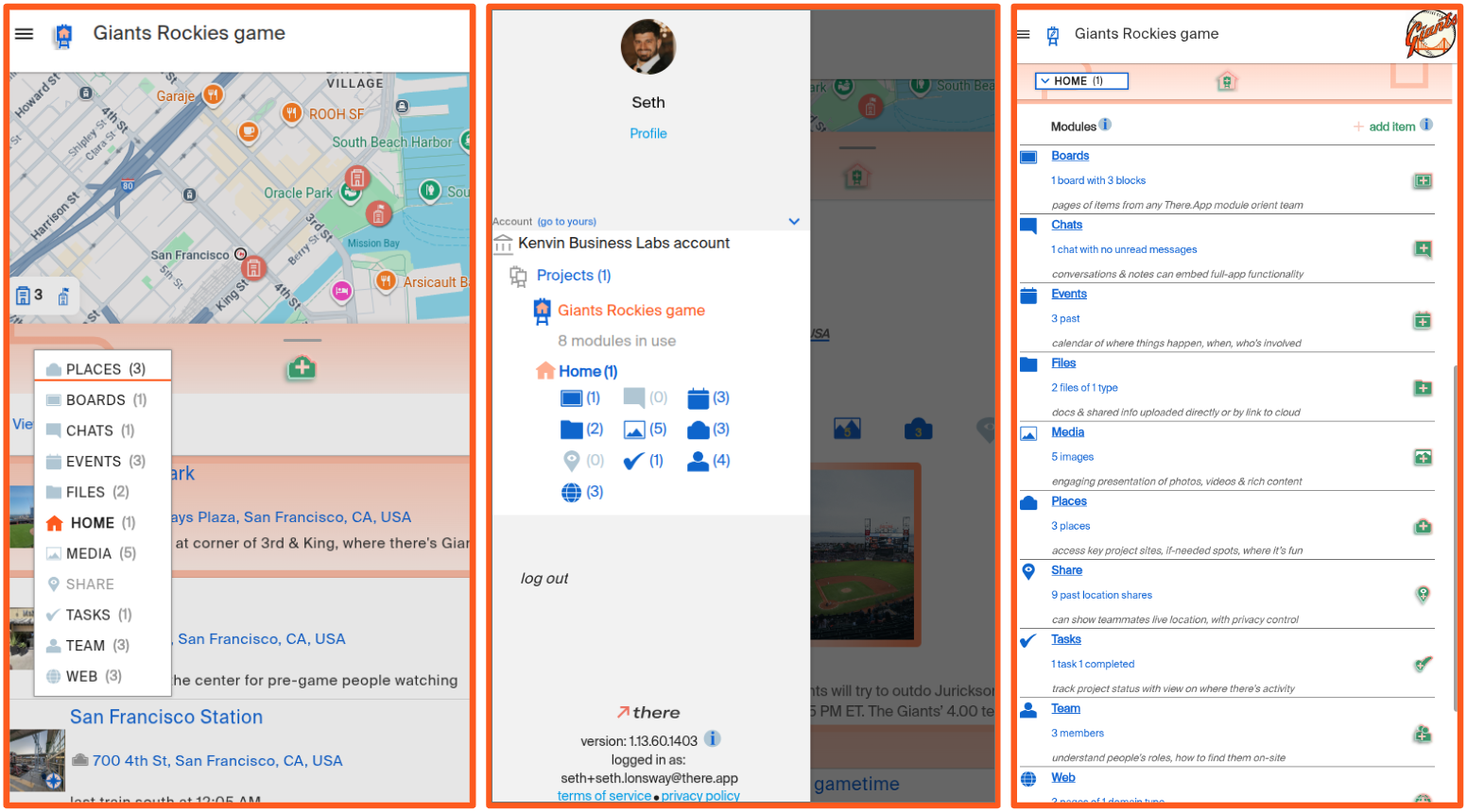
We initially built navigation across that scope through a scroll-able horizontal strip of module names (“Team”, “Chat”, “Files” etc.) towards the top of the screen. This was consistent with common mobile interfaces you may associate with other enterprise applications or social services. But this presentation wasn’t consistent with our opinions about how software used on-location should work. Showing people multiple options that invite engagement entices them to tap around and wind up stuck in their devices, instead of quickly addressing just what needs attention now and re-directing attention to live activities. To streamline, we moved to a drop-down menu generally featuring just the current module in use, requiring the menu be opened to reveal the rest of the modules available for selection. So now, when on the There.App Places module, people just see that one module name along with its associated iconography and items like project venue, accommodations or where to get services that may be useful, which may be all someone needs in the moment, or if there's more to do in the app, they can simply open the drop-down and move onto another module.
The dropdown keeps the There.App interface lean and straightforward about what module is in use, and it’s quickly mastered for agile navigation to whatever else someone may need. But, it is a little bit unconventional for a mobile app, and as we observe new use we’ve realized people often initially click elsewhere to find other modules, like the “hamburger button” which is the software industry nickname for the familiar, tight stack of three horizontal lines that indicate where menus are available. So, we’ve put module selection there too! All shown in this post's image, there are now three main ways to navigate within There.App that are all one-tap accessible from any module: (1) the central dropdown, (2) the side-navigation menu presented from the hamburger button, or (3) tapping on top of the screen for the Home module which links to all of the other modules along with brief descriptions and indications of their statuses within the project.
The result is instant mastery for people to find the module they need when they need it without distractions or being held back by unproductive navigation experiments. Everyone gets quick and clear app navigation, however they choose to approach it. The solution folds in suggestions we’ve gotten to fulfill our highest-level opinions about how to make the best software for people coordinating on-location activities: emphasizing clear and concise support of great, live engagement.
.png)

