Style Guide

Colors
Add these as variables
#ea7466 - Coral
#f8cdc3 - Light Coral
#1a67d2 - Blue
#b0c6d3 - Light Blue
#837f2c - Olive
#c2cd97 - Light Olive
#d48063 - Sienna
#f7d3ae - Light Sienna
#dac557 - Yellow
#f4eec3 - Light Yellow
#3c986c - Green
#acdcca - Light Green
#9c4b6c - Wine
#e3c7d2 - Light Wine
#333333 - Black
#666666 - Gray Dark
#999999 - Gray
#E0E0E0 - Gray Light
#F2F2F2 - Gray Lightest
#FFFFFF - White
rgba(255, 255, 255, 0) - Transparent
Typography
Base Classes & Headings
All Paragraphs

No class here; standard paragraph size — set size within variables.

All Links
All Links
All Block Quotes
Block Quote
All Unordered Lists
  • Bullet list item
  • Bullet list item
All Ordered Lists
  1. Numbered list item
  2. Numbered list item
  3. Numbered list item

IMPORTANT!

  • From Variables: Usually add modes for 1440px+ and Mobile L; Base Mode (Desktop) can also often be used for 1280 & Tablet too.
  • From BASE Mode (desktop) in Designer: For each H level, set text weight, % height (leading), letter spacing (kerning), & margins.
All H1 Headings

H1: set as variables

All H2 Headings

H2: set as variables

All H3 Headings

H3: set as variables

All H4 Headings

H4: set as variables

All H5 Headings
H5: set as variables
All H6 Headings
H6: set as variables
Heading Sizes as Text not Headers (i.e. when you want an H1 to be the size of an H3, OR a text block to be the size of an H4)

IMPORTANT!

  • From BASE Mode (desktop) for each text block (H level) below: Manually tie each of these to their corresponding H-level variable, so "Size" (next to purple variable) appears as blue.
  • From BASE Mode (desktop) for each text block (H level) below: Also manually match text weight, % height (leading), letter spacing (kerning), & margins w/ pink H values.
h1
H1 size - tied to variable
h2
H2 size - tied to variable
h3
H3 size - tied to variable
h4
H4 size - tied to variable
h5
H5 size - tied to variable
h6
H6 size - tied to variable
eyebrow
Eyebrow - tied to variable
Paragraph Sizes
p1

Large paragraph here - set within variables

p2-default

Mirrors 'all paragraphs' above but has blue class.

p3

Small paragraph here - set within variables

p4
Extra small paragraph here - set within variables
Text Weights

IMPORTANT!

text-weight-100

Set text weight to this class after font(s) installed; prefer variable font(s).

text-weight-200

Set text weight to this class after font(s) installed; prefer variable font(s).

text-weight-300

Set text weight to this class after font(s) installed; prefer variable font(s).

text-weight-400

Set text weight to this class after font(s) installed; prefer variable font(s).

text-weight-500

Set text weight to this class after font(s) installed; prefer variable font(s).

text-weight-600

Set text weight to this class after font(s) installed; prefer variable font(s).

text-weight-700

Set text weight to this class after font(s) installed; prefer variable font(s).

text-weight-800

Set text weight to this class after font(s) installed; prefer variable font(s).

text-weight-900

Set text weight to this class after font(s) installed; prefer variable font(s).

Rich Text Block
rich-text-block

Heading 1

Heading 2

Heading 3

Heading 4

Heading 5
Heading 6
This is a block quote

The rich text element allows you to create and format headings, paragraphs, blockquotes, images, and video all in one place instead of having to add and format them individually. Just double-click and easily create content.

This is a link inside of a rich text

  • List item
  • List item
  • List item
  1. List item
  2. List item
  3. List item
Caption goes here
Text Alignment
text-align-left
text-align-left
text-align-center
text-align-center
text-align-right
text-align-right
text-wrap-balance
text-wrap-balance
Text Max Character Widths
max-char-10
This is some text inside of a div block.
max-char-20
This is some text inside of a div block.
max-char-24
This is some text inside of a div block.
max-char-32
This is some text inside of a div block.
max-char-40
This is some text inside of a div block.
max-char-48
This is some text inside of a div block.
max-char-56
This is some text inside of a div block.
max-char-64
This is some text inside of a div block.
UI Elements
Buttons
button
button
small
button
secondary
button
secondary
small
To use on a dark background, use the add-on class on-dark-bg
button
on-dark-bg
button
on-dark-bg
small
button
on-dark-bg
secondary
button
on-dark-bg
secondary
small
Buttons With Icons
button
with-icon
button
small
with-icon
button
secondary
with-icon
button
secondary
small
with-icon
Form Elements
field-label
form-input
form-input
text-area
form-input
select-input
form-checkbox
form-radio
button
Thank you! Your submission has been received!
Oops! Something went wrong while submitting the form.
Icons (Image)

icon-height-1rem

icon-height-1.5rem

icon-height-2rem

icon-height-3rem

icon-height-5rem

icon-height-6.5rem

icon-height-custom1

Icons (HTML Embed)
HTML embed icons enable you to control icon color on hover.

icon-embed-1rem

icon-embed-1.5rem

icon-embed-2rem

icon-embed-3rem

icon-embed-5rem

icon-embed-6.5rem

icon-embed-custom1

Effects
Box Shadows
Shadows allow you to add depth and realism to designs by positioning elements on a z-axis.
shadow-xxsmall
shadow-xsmall
shadow-small
shadow-medium
shadow-large
shadow-xlarge
shadow-xxlarge
Structure Classes
div-flex
div-flex-zigzag
div-flex-center
div-flex-center-stacked
div-flex-center-center
center-auto
width-100pct
width-80pct
width-75pct
width-50pct

Card Header

MRA hosts several major events throughout the year that bring together world renowned researchers, physicians, patient advocates, donors, and partners, all working to advance melanoma research.

Learn More
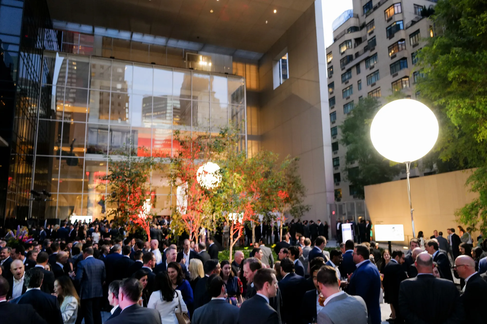
LFFM Melanoma Research Alliance fundraising events in London and New York City
Layering Classes
hide
This element is hidden
tablet-hide
mbp-hide
mobile-hide
overflow-visible
overflow-hidden
overflow-auto
overflow-scroll
z-index-1
z-index-2
Radius borders
radius-1rem
radius-1.5rem
radius-2rem
radius-2.5rem
radius-3rem
radius-3.5rem
Margins
flush
margin-top-auto
margin-bottom-auto
margin-top-0
margin-bottom-0
margin-0
margin-0.5rem
margin-top-0.5rem
margin-bottom-0.5rem
margin-1rem
margin-top-1rem
margin-bottom-1rem
margin-1.5rem
margin-top-1.5rem
margin-bottom-1.5rem
margin-2rem
margin-top-2rem
margin-bottom-2rem
margin-3rem
margin-top-3rem
margin-bottom-3rem
margin-4rem
margin-top-4rem
margin-bottom-4rem
margin-6rem
margin-top-6rem
margin-bottom-6rem
margin-8rem
margin-top-8rem
margin-bottom-8rem
Paddings
padding-0
padding-top-0
padding-bottom-0
padding-0.5rem
padding-top-0.5rem
padding-bottom-0.5rem
padding-1rem
padding-top-1rem
padding-bottom-1rem
padding-1.5rem
padding-top-1.5rem
padding-bottom-1.5rem
padding-2rem
padding-top-2rem
padding-bottom-2rem
padding-3rem
padding-top-3rem
padding-bottom-3rem
padding-4rem
padding-top-4rem
padding-bottom-4rem
padding-6rem
padding-top-6rem
padding-bottom-6rem
padding-8rem
padding-top-8rem
padding-bottom-8rem